
Polo Extra Strong has never been anything but known for its strong flavor and bold character. But the brand needed to bring its communication into even sharper, fresher focus, something that visually conveyed the strength of "Extra Strong" through print communications, packaging, and in-store touchpoints. The poster had to be given a new update- unless we needed one right there. The key visual was created to work over print media advertising, in-store displays, outdoor billboards, and promotional material. They wanted it dynamic, gritty, and unmistakably Polo-all while keeping in spirit with the brand heritage. To get that to work, Polo needed more than a designer. They needed a creative design firm that knew branding and the commercial realities of printing services, someone who could consider concept and execution simultaneously.
Polo Extra Strong had to deliver the brand’s punch-and-refresh positioning in a fiercely competitive, flavor-led mint market.
The mint category was crowded with strong flavour variants, making it difficult for Polo Extra Strong to differentiate based purely on something “extra strong”.
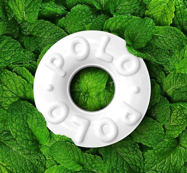
The brand had to enhance the perception of strength and refreshment without compromising the playful, approachable ethos of Polo (the “mint with the hole”).
Packaging and communication needed to signal bold flavour clearly and instantly, across both retail shelves and digital thumbnails.
The challenge was to strike a balance between high impact messaging (strong mint) and brand continuity to ensure that the Polo identity was still recognizable and consistent.
In short, the challenge was to differentiate Polo Extra Strong as both powerfully strong and refreshingly Polo by ramping up the intensity whilst maintaining the familiar brand warmth.
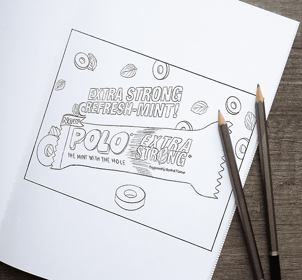
We began by exploring what “Extra Strong” truly feels like—not just a flavor, but a burst of intensity. That idea became the creative anchor for the entire design system.
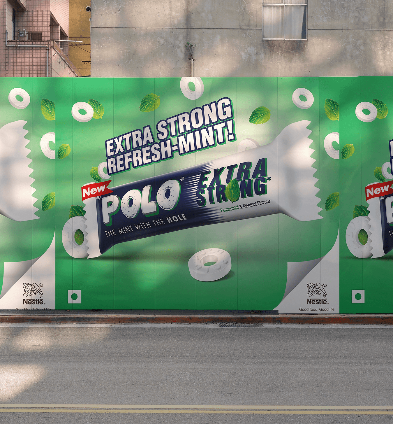
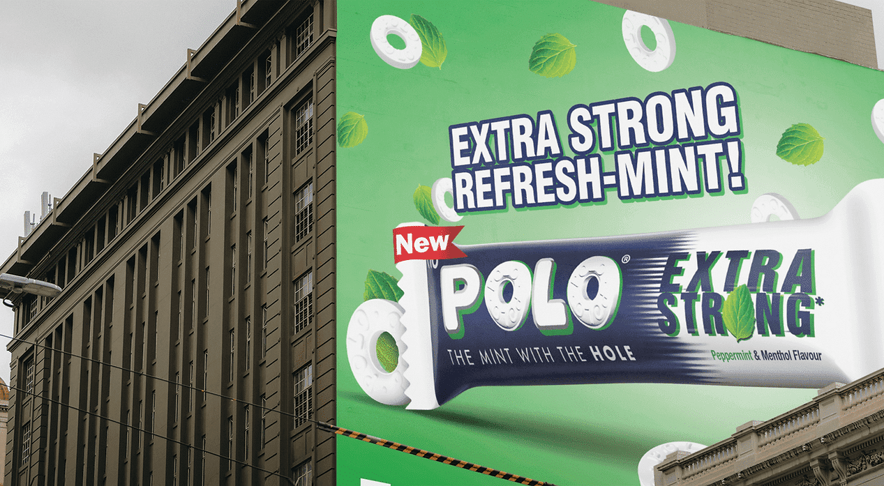
The centerpiece was a bold, slashing “X” from the word "Extra," slicing through the visuals to express strength, speed, and power. It became the brand’s unmistakable symbol of energy.
Around this, we built a visual language of motion lines, textured backdrops, and high-contrast compositions that radiated dynamism and impact.
The result was a flexible, scalable identity system, instantly recognizable as “Extra Strong” across packaging, print, and retail, a brand that visually hums with energy.
Because print advertisement design was central to this project, we paid close attention to how the visual would perform on different surfaces. A key visual might look great on a laptop screen, but print is a different world.
We tested the design across small magazine formats, large outdoor billboards, and in-store panels. We adjusted typography, textures, and color layers so that the final artwork would retain its boldness even at a distance or under different lighting.
We also worked hand in hand with trusted printing companies, providing precise color separations, bleed settings, and finish specifications to make production seamless. This is where our experience as a printing agency really comes through; we don’t hand over files and hope for the best; we guide the entire print journey.
Once the key visual was finalized, we rolled it out across a full print and media advertising toolkit: Posters and billboards with striking “X” motifs for outdoor visibility. Retail display panels and shelf talkers for in-store presence. Creative print advertisement layouts for magazines and flyers. Technical print-ready files tailored for different print vendors, ensuring consistent results everywhere.
Every piece was part of one story, a bold, high-energy visual that lived confidently across formats.
The new key visual gave Polo Extra Strong a fresh, attention-grabbing identity that worked beautifully in print media advertising and retail spaces.
Retailers noticed stronger shelf presence and improved recall.
Outdoor placements stopped traffic, thanks to the crisp, punchy visuals.
Because both the design and advertising print services were aligned from the beginning, the end products came out crisp, colorful, and just as planned.
It showed that by using the correct method, print advertising can still pack a punch.
This project is a reminder that good branding doesn't stop at the computer screen. When design and print are hand in hand, the results are tangible, memorable, and powerful.
Print media designs are strongest when they’re created with real materials and finishes in mind.
Working closely with printing services ensures fidelity and consistency across every execution.
A strong print advertisement design can unify a campaign across media, from retail to outdoor to editorial.
And above all, thoughtful print and media advertising can give a classic brand like Polo a fresh, modern punch.
Do you have a project in mind? Regarding Digital Marketing, Packaging Design, Branding, Print Media, 3D & CGI, AR/VR & Game Tech, films, animation & VFX, Illustration, Web Development, AI design—really any of our blend of creative services—we can help. Call us at our multimedia 360° marketing agency, animation studio, web development company, or video production house - we can't wait to team up.
At PRAKRIA, we don’t simply make visuals—we create connections of people to the thoughts through experiences.