
Singaporean coffee culture is alive and thriving. NESCAFÉ sought to bottle all that energy and make a celebration that appealed to devoted followers as well as new generation coffee connoisseurs. The concept was daring: introduce a Coffee Fiesta — a fiesta-like persona that interweaves tradition with newness. But how do you bring the festival into a package? How do you imbue a jar or sachet with the essence of a celebration? That's when PRAKRIA intervened with our experience in packaging design services, brand packaging design, and innovative packaging design.
When the culture of cafés and growing local coffee pride was all the rage, NESCAFÉ Singapore took it upon itself to celebrate the drink in a manner that brought together coffee lovers of all kinds.
The coffee landscape in Singapore was flourishing with artisanal cafés and a younger crowd eager for more experiential coffee.
NESCAFÉ had to appeal to the younger generations – the Gen-Zs and millennials, but still hold onto the traditional coffee drinkers.
Aim was for the event to have mass appeal and visibility, be vibrant, inclusive and oozing with the NESCAFÉ identity.
The challenge was to globally align but locally infuse to create something that would captivate the hearts and minds of Singapore’s coffee culture.
Simply put, the challenge ahead was to weave together the traditional and the contemporary, to turn a household name into the lifeblood of Singapore’s largest ever coffee celebration.
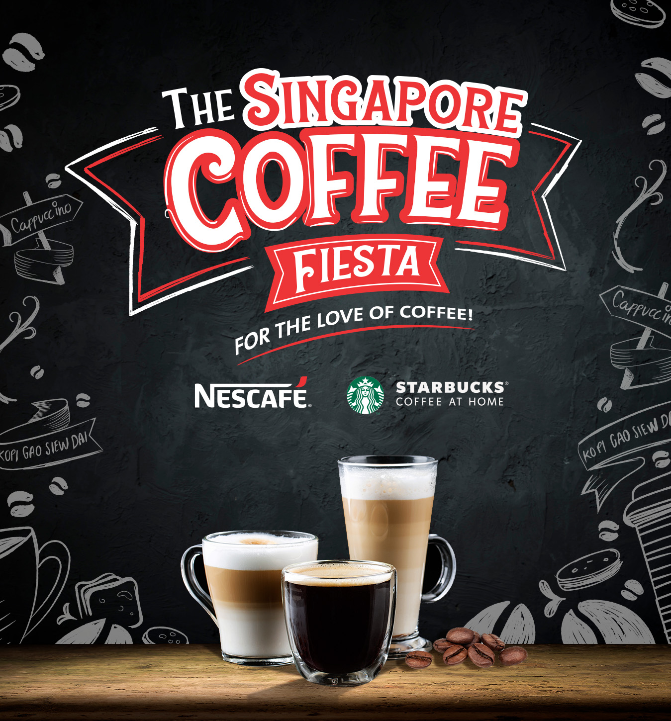
The goal was to capture the spirit of Singapore’s vibrant coffee culture from the traditional kopitiams to modern coffee houses and translate that energy into a cohesive, celebratory brand experience for NESCAFÉ.
We immersed ourselves in the local coffee scene, observing how people connect, converse, and create moments over a cup. This deep dive inspired the Coffee Fiesta personality, colorful, young, and accessible, embodying the joy of shared coffee moments.
The Fiesta became a unifying theme across all packs, a celebration of flavor, culture, and connection. Each variant was designed to feel like part of one vibrant festival while retaining its own unique charm.
Every visual element reflected the festive energy of the theme: Typography, color palettes, and layouts evoked celebration and togetherness. Consistent brand cues ensured strong alignment with NESCAFÉ’s recognizable identity. Dynamic compositions added a sense of movement and joy, mirroring the rhythm of Singapore’s café culture.
The Coffee Fiesta range transformed everyday coffee into a cultural celebration, uniting diverse flavors and experiences under one energetic, cohesive identity that remained true to NESCAFÉ’s brand essence.
We placed Coffee Fiesta as a premium sub-brand under NESCAFÉ and employed festive motifs such as beans, whirling steam, and cityscapes.
The artwork was playful and strong, making energy and freshness conveyed at once.
We balanced creativity with readability, making sure that product information and festive components coexisted beautifully.
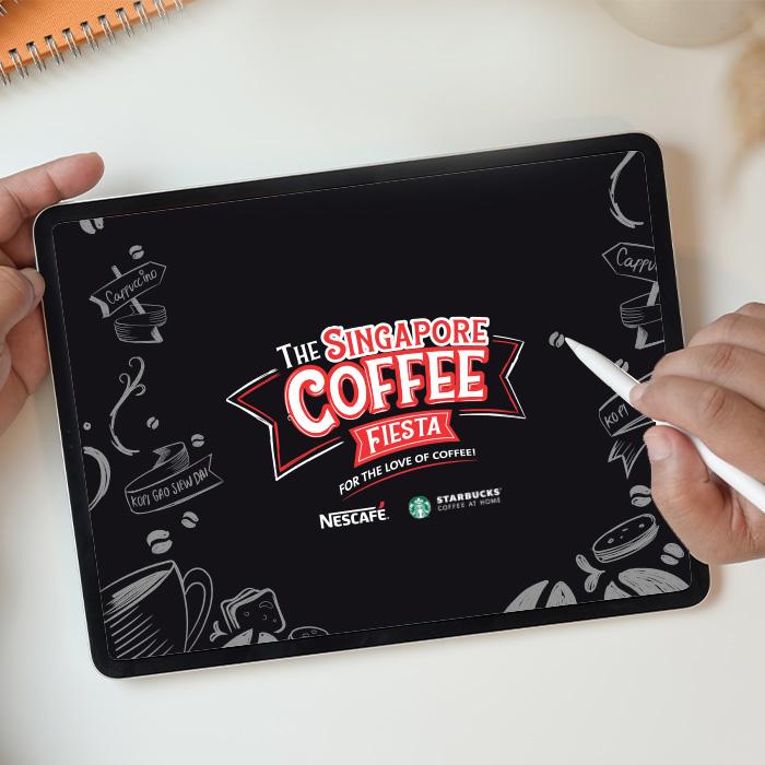
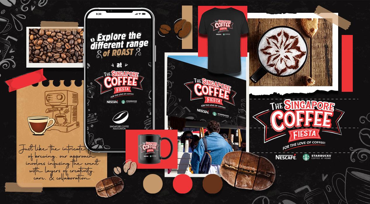
The Fiesta identity was adapted across jars, single-serve sachets, and gift packs, ensuring consistency in every format.
We used special finishes, layered textures, and spot colors to make the packs more tactile and festive.
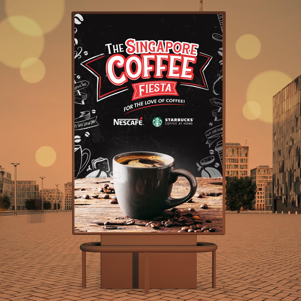
At the supermarket shelf or online, the Coffee Fiesta packs caught the eye and heart.
This was more than just food packaging design; it was storytelling through design.
The launch of the Coffee Fiesta in Singapore was met with enthusiasm:
Consumers found packs to be engaging and evocative.
Younger viewers responded to the fun vibrancy, while existing NESCAFÉ customers valued the premium enhancement.
The campaign had strong digital traction, with people sharing packs on social media as collectibles.
Retailers noted improved visibility and stronger brand recall compared to competing coffee products.
The packaging itself became part of the Fiesta, not just the vessel but the message.
This project is a reminder of how powerful packaging design services can be when culture, creativity, and brand values meet.
Product packaging design goes beyond functionality to inspire joy.
Creative package design tells a story through visuals and structure.
Custom packaging design adapts to different formats while keeping consistency.
Packaging designers become cultural interpreters, not just visual stylists.
Brand packaging design creates trust, recall, and identity.
Retail packaging design ensures standout presence both offline and online.
At PRAKRIA, we see packaging as more than a wrapper. It’s the face of the brand, the first handshake with consumers, and often, the reason someone decides to engage. Coffee Fiesta proved that right.
Do you have a project in mind? Regarding Digital Marketing, Packaging Design, Branding, Print Media, 3D & CGI, AR/VR & Game Tech, films, animation & VFX, Illustration, Web Development, AI design—really any of our blend of creative services—we can help. Call us at our multimedia 360° marketing agency, animation studio, web development company, or video production house - we can't wait to team up.
At PRAKRIA, we don’t simply make visuals—we create connections of people to the thoughts through experiences.